Chapter 6. Data Inspection
Table of Contents
In this section you are able to view the measurement data, plot it and view hourly averages.
6.1. Plots
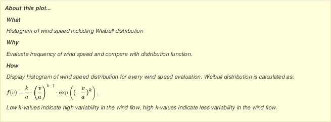
Use AmmonitOR to quickly generate plots with measurement data over a defined period. Typical diagrams can be created for wind and solar resource assessment campaigns as well as for power curve measurement projects, e.g., correlation plots, xy plots or energy yield calculations. Information boxes describe, what is displayed in the diagram and how the values are calculated.
AmmonitOR offers various options to customise the plots, e.g., choose the time range, which should be displayed or the sensors, which should be correlated. In this chapter we list all plots, which are currently available in AmmonitOR. Further plots will be added in the future in order to meet your requirements to effectively monitor your projects.
All plots can be exported to PDF format. Thus diagrams can easily be printed and archived.
![[Important]](admon/important.png) | Important |
|---|---|
AmmonitOR's plots always show unfiltered data, except in one usecase, where data, recorded by a LiDAR device, is displayed by Availability plot (See section Section 6.1.3.1, “Avaliability”). |
AmmonitOR lists plots for five different applications. Each plot is marked with its unique icon:
Figure 6.1. Overview selectable plots
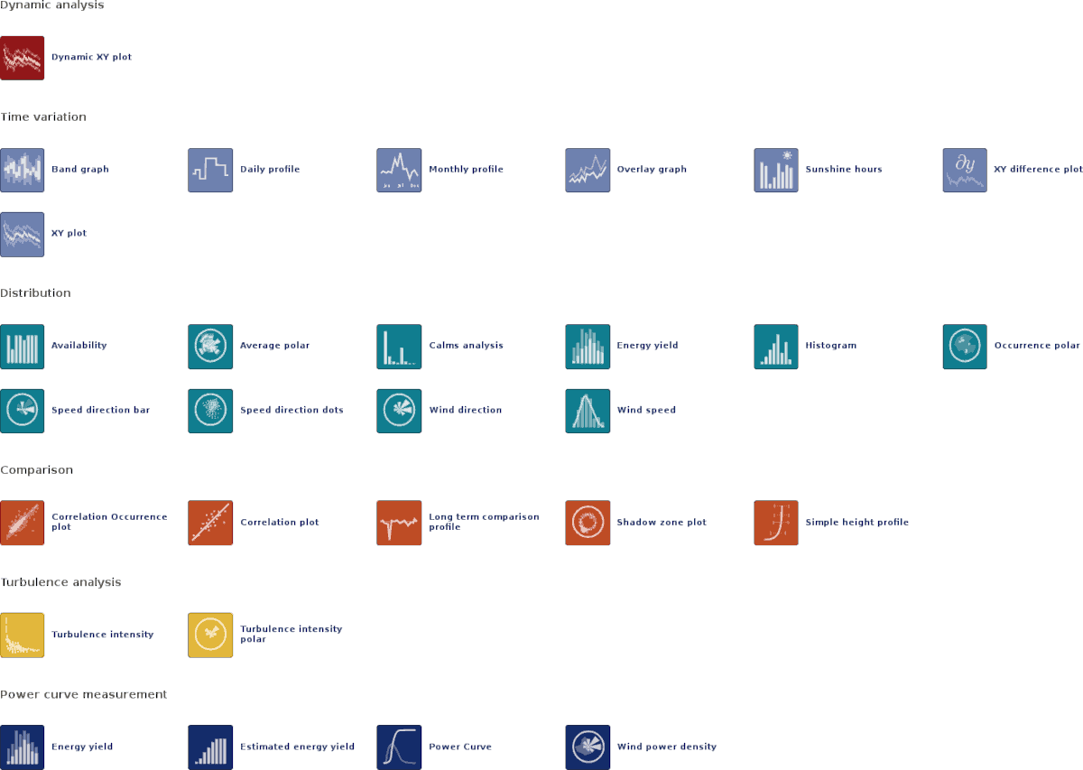
- Dynamic analysis
Select plots, which display the behaviour of measurements over a certain time period and allow interactive analysis - marked with red icons
Dynamic XY plot
- Time variation
Select plots, which display the behaviour of measurements over a certain time period - marked with light-blue icons
Band graph
Daily profile
Monthly profile
Overlay graph
Sunshine hours
XY plot
XY difference plot
- Distribution
Select plots, which show the frequency distribution of measurement values - marked with turquoise icons
Availability
Average polar
Calms analysis
Energy yield
Histogram
Occurency polar
Speed direction bar
Speed direction dots
Wind direction
Wind speed
- Comparison
Select plots, which correlate measurements of sensors of the same type to identify measurement errors - marked with orange icons
Correlation Occurency plot
Correlation plot
Long term comparison profile
Shadow zone plot
Simple height profile
- Soiling measurement
Select plots, which display soiling related measurements like soiling ratio or related temperature and radiation measurements to evaluate the soiling situation at site - marked with violet icons
Soiling Loss Index
Soiling Ratio
XY Soiling profile
- Turbulence analysis
Typical plots to display turbulence intensity - marked with yellow icons
Turbulence intensity
Turbulence intensity polar
- Power curve measurement
Typical plots for power curve measurement - special power curve measurement devices necessary, e.g., power meter - marked with dark-blue icons
Energy yield
Estimated energy yield
Power curve
Wind Power Density
In order to show only relevant plots for solar or wind, select one of the radio buttons on top of the page.
6.1.1. Dynamic analysis
This section lists all plots, which provides interactive analysis of measurement data.
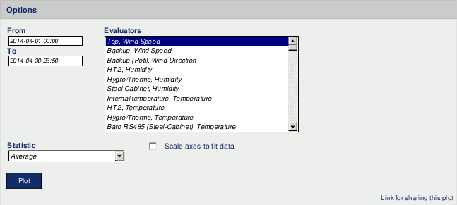
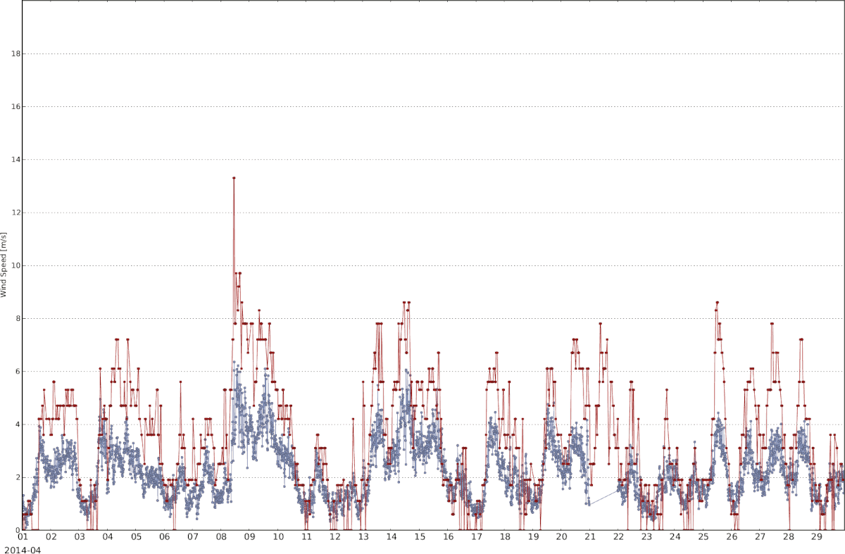
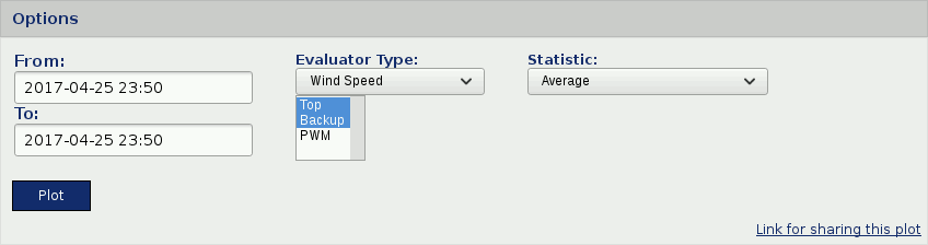
6.1.1.1. Dynamic XY plot
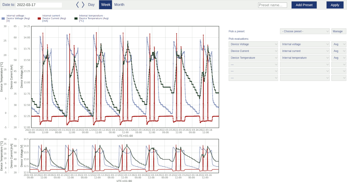
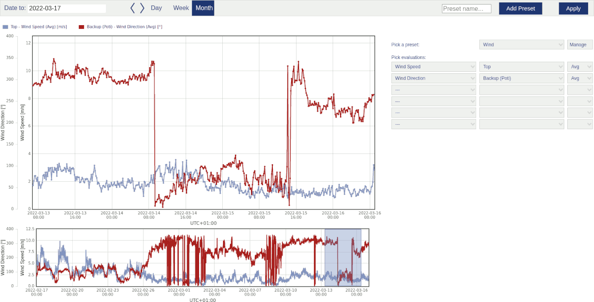
Use the dynamic xy plot to monitor the behaviour of different evaluations over a determined time. One ore more sensors can be displayed in the plot.
Go to the Data inspection → Plots menu and select in section Time variation the Dynamic XY plot. Select a data logger from the project and determine the period. Choose the Evaluators, which should be monitored. Select a Statistic and click on to display the diagram.
The plot is splitted into two graphs. The upper graph is used for zoom and detail analysis. The lower graph displays always the chosen timespan overview. It does not move or zoom, but it is possible to select an area to enable detail analysis in upper graph section.
Evaluations with available statistics are displayed next to the right border of plot area. The number of evaluations is limited to five. Pick an evaluation type and statistic and the available evaluations will be displayed. Select one or more of them. To update the graph with new selection click button . If you want to save your setup as preset, give it a name in the text field left of the "Add Preset" button, click .
Above the plot area is a timepicker field. Chose "date from" date and a period like "Day", "Week" or "Month". E.g. if a date is defined and "Day" is selected, the next 24h will be displayed. With "Week" selected, a timspan of a week will be displayed. Start date is the date you defined.
The upper graph is zoomable by mouse wheel or select an area in lower graph.
In upper graph the lines are highlightable. If you click on one line you want to highlight, the other lines will fade out. To reset the focus click on empty space in the upper plot area. It is also possible to click on the evaluation name above upper plot area. The related line will disappear. Click again and the line will be displayed again.
To get detail information about single measurment points, hover the mouse pointer over the line section. The tooltip shows the selected timestamp and all evaluations with values.
![[Tip]](admon/tip.png) | Tip |
|---|---|
You can switch between the periods "Day", "Week" and "Month" with already selected evaluations. It is not necessary to use "Apply" button. |
Figure 6.2. Options: Dynamic xy plot
Existing presets can be picked with the dropdown menu next to the button. To manage presets click to see all your created presets listed. One of them can be set as default. Means if you enter the dynamic XY plot page the next time this preset will be shown first. The system will pick a default preset, if not otherwise defined.
It is also possible to rename existing presets, click to do so. In the edit menu the preset can also be deleted. To set the preset as default, click button.
6.1.2. Time variation plots
This section lists all plots, which show the behaviour of measurement values over a certain time period.
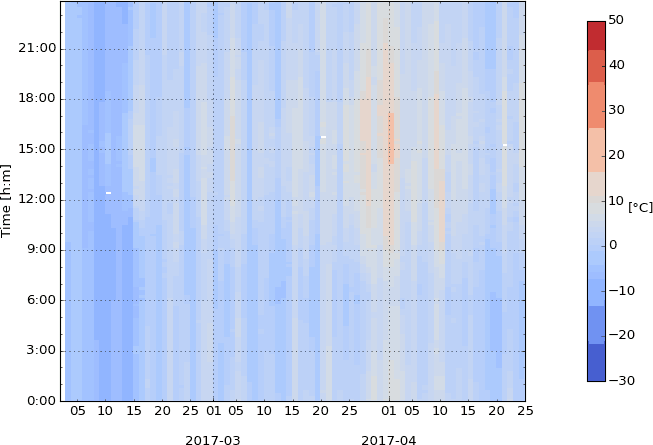
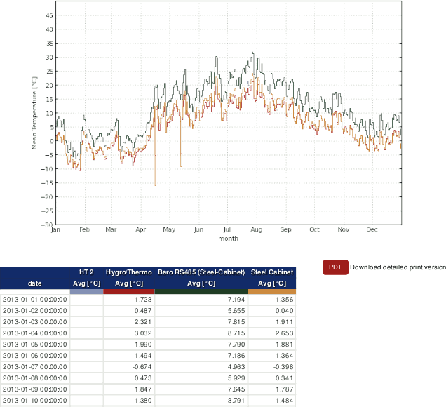
6.1.2.1. Band graph
The band graph indicates the daily behaviour of an evaluation for a specified period. Thus the differences between day and night can be analysed. Only one sensor can be displayed in a graph.
AmmonitOR considers all hourly average values of a sensors over a certain period. For every hour of the day the average value is calculated and displayed in the diagram. Each sensor is represented in a graph, e.g., different temperature sensors.
Figure 6.3. Options: Band graph of the temperature
Go to the → menu and select in section Time variation the Band graph. Select a data logger from the project and enter the period, which should be displayed in the diagram. Choose an Evaluation from the dropdown list and click on Plot to display the band graph.
A data table can be displayed by clicking on Show data table. In the data table AmmonitOR lists for all sensors the hourly average values. To hide the data table, click on Hide data table.
| Tip |
|---|---|
The plot can be shared with other project users, e.g., to inform about any circumstances. Click on Link for sharing this plot. A URL is displayed, which can be copied to an email. |
![[Note]](admon/note.png) | Note |
|---|---|
Click on PDF to open a PDF file with the plot. |
Figure 6.4. Example: Band graph of the temperature
 |
6.1.2.2. Daily profile
The daily profile indicates the daily behaviour of an evaluation for a specified period. Thus the differences between day and night can be analysed. Each sensor is displayed in a graph.
AmmonitOR considers all hourly average values of a sensors over a certain period. For every hour of the day the average value is calculated and displayed in the diagram. Each sensor is represented in a graph, e.g., different temperature sensors.
Figure 6.5. Options: Daily profile of the temperature
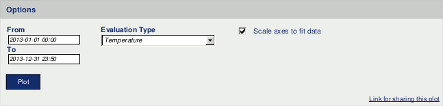
Go to the → menu and select in section Time variation the Daily profile. Select a data logger from the project and enter the period, which should be displayed in the diagram. Choose an Evaluation type from the dropdown list and click on Plot to display the daily profile. Select Scale axis to fit data to get a more detailed view.
Figure 6.6. Example: Daily profile of the temperature
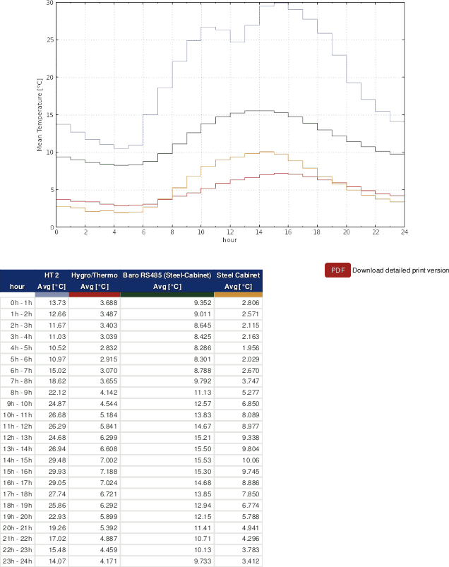 |
A data table can be displayed by clicking on Show data table. In the data table AmmonitOR lists for all sensors the hourly average values. To hide the data table, click on Hide data table.
| Tip |
|---|---|
The plot can be shared with other project users, e.g., to inform about any circumstances. Click on Link for sharing this plot. A URL is displayed, which can be copied to an email. |
| Note |
|---|---|
Click on PDF to open a PDF file with the plot. |
6.1.2.3. Monthly profile
The monthly profile emphasises on the seasonal impacts on the evaluation by following trends in a curve. Sensor defects can be detected.
Go to the → menu and select in section Time variation the Monthly profile to generate a monthly profile plot. Select a data logger and determine the time period, which should be considered for the plot. Choose an Evaluator type, e.g., wind speed or temperature. Select an Average calculation method:
Average for each month
Average for each hour
Moving average (based on hourly averages) - a moving average window has to be selected: month, 2 weeks, week
Figure 6.7. Options for Monthly Profile
- Monthly average
Indicates the seasonal differences of the evaluations, based on average values of each month.
Figure 6.8. Example: Monthly profile of temperature based on monthly averages
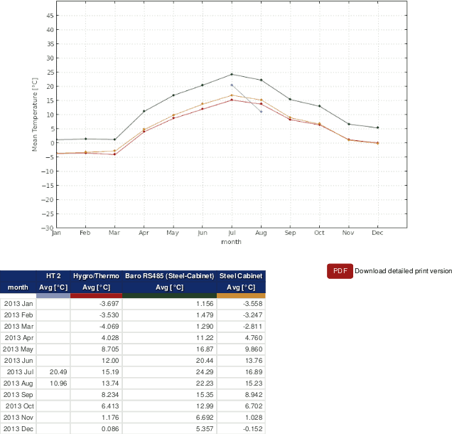
Note If a sensors has had a defect, you can see a deviation in the graph compared to other sensors for the same evaluation as shown in Figure 6.8, “Example: Monthly profile of temperature based on monthly averages”.
- Hourly average
Displays the seasonal differences of the evaluations more detailed, based on hourly average values.
Figure 6.9. Example: Monthly profile of temperature based on hourly averages
Note If a sensors has had a defect, you can see a deviation in the graph compared to other sensors for the same evaluation as shown in Figure 6.9, “Example: Monthly profile of temperature based on hourly averages”.
- Moving average
Displays the trend of the monthly average more detailed. Based on hourly averages, AmmonitOR calculates the moving average on a monthly, 2-weekly or weekly basis for each sensor. Select the basis for the moving average graph from the Choose moving average window dropdown list.
Equation 6.1. Calculation of moving average (x (t))
Figure 6.10. Example: Moving average of temperature based on monthly averages
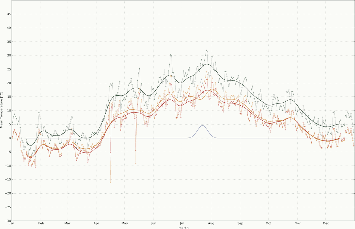
Note If a sensors has had a defect, you can see a deviation in the graph compared to other sensors for the same evaluation as shown in Figure 6.10, “Example: Moving average of temperature based on monthly averages”.
| Tip |
|---|---|
The plot can be shared with other project users, e.g., to inform about any circumstances. Click on Link for sharing this plot. A URL is displayed, which can be copied to an email. |
| Note |
|---|---|
Click on PDF to open a PDF file with the plot. |
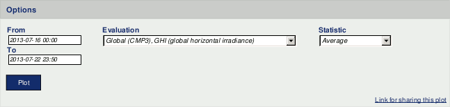
6.1.2.4. Overlay graph
The periodical overlay graph completes the xy plot (see Section 6.1.2.6, “XY plot”). Using this diagram, periodical occurrences can be monitored and the trend of an evaluation can be analysed.
Ammonit displays for each day (x-axis) a coloured graph (see key next to the diagram) - all graphs are shown in one diagram. The trend of the evaluation can be monitored. Unexpected deviations can indicate measurement errors or defective sensors.
Go to the → menu and select in section Time variation the Overlay graph. Select a data logger from the dropdown list and specify the period, which should be displayed. Choose an evaluation and select a statistic, e.g., average.
Figure 6.11. Options for the overlay graph
Click on Plot to display the diagram.
Figure 6.12. Example: Global horizontal irrediance for a specified period in an overlay graph
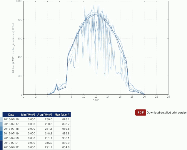 |
Below the plot a data table is shown. If the data table has more than 10 rows, the table is hidden. Click on Show data table to display the table, on Hide data table to hide the table.
| Tip |
|---|---|
The plot can be shared with other project users, e.g., to inform about any circumstances. Click on Link for sharing this plot. A URL is displayed, which can be copied to an email. |
| Note |
|---|---|
Click on PDF to open a PDF file with the plot. |
6.1.2.5. Sunshine hours
The plot displays the daily sunshine hours in a bar chart. According to WMO the sun is shining at 120 W/². Sunshine duration sensors measure the sun status. The sun status can also be calculated by Ammonit Meteo-40, Meteo-40 Plus and Meteo-42 data loggers from measurement data gathered by a pyranometer. AmmonitOR does not calculate the sun status from pyranometer measurement data.
Go to the → menu and select in section Time variation the Sunshine hour plot. Select a data logger from the project and determine the period, which should be considered. Choose an Evaluation and click on Plot.
Figure 6.13. Options for sunshine hours plot
Figure 6.14. Example: Sunshine hours for a determined period
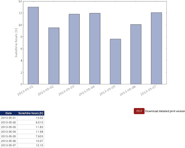 |
AmmonitOR shows the daily number of sunshine hours in a data table. If more than 10 days are listed, click on Show data table to display the table, on Hide data table to make the table hidden.
| Tip |
|---|---|
The plot can be shared with other project users, e.g., to inform about any circumstances. Click on Link for sharing this plot. A URL is displayed, which can be copied to an email. |
| Note |
|---|---|
Click on PDF to open a PDF file with the plot. |
6.1.2.6. XY plot
Use the xy plot to monitor the behaviour of different evaluations over a determined time. One ore more sensors can be displayed in the plot.
Go to the
→ menu and select in section
Time variation the
XY plot. Select a data logger from the project and determine the
period. Choose the
Evaluators, which should be monitored. If more than one sensor
should be displayed, hold the
CTRL key and use the left-mouse click to select additional sensors.
Select a
Statistic and click on
Plot to display the diagram.
For comparability all plots of the same evaluation show a common scale. In order to view more details in the plot, the axes can be scaled to fit by activating on the Scale axes to fit data checkbox.
Figure 6.15. Options for XY plot
AmmonitOR displays the plot with the evaluation on the y-axis (e.g., temperature and humidity) and time on the x-axis.
Figure 6.16. Example: Temperature for a determined period in XY plot
 |
| Tip |
|---|---|
The plot can be shared with other project users, e.g., to inform about any circumstances. Click on Link for sharing this plot. A URL is displayed, which can be copied to an email. |
| Note |
|---|---|
Click on PDF to open a PDF file with the plot. |
6.1.2.7. XY difference plot
The XY difference plot draws the difference between two evaluations of same evaluation type of a specified period.
Figure 6.17. Options: XY difference plot of the temperature
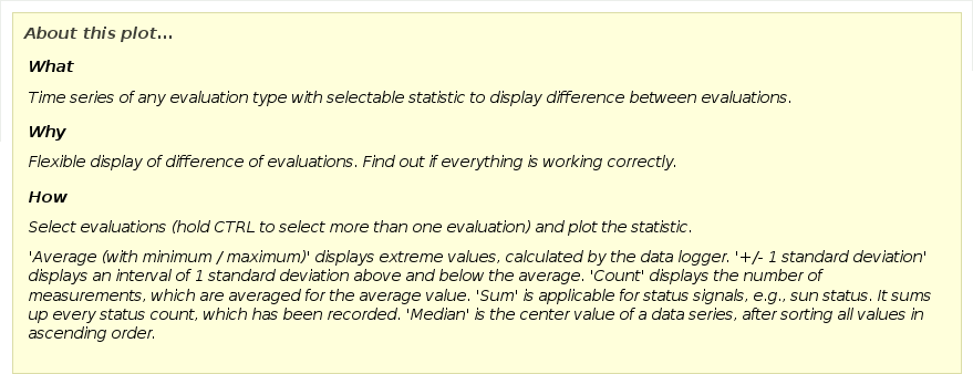
Go to the → menu and select in section Time variation the XY difference plot. Select a data logger from the project and enter the period, which should be displayed in the diagram. Choose at least two Evaluations from the dropdown list and click on Plot to display the XY differenc plot.
| Tip |
|---|---|
The plot can be shared with other project users, e.g., to inform about any circumstances. Click on Link for sharing this plot. A URL is displayed, which can be copied to an email. |
| Note |
|---|---|
Click on PDF to open a PDF file with the plot. |
Figure 6.18. Example: Wind speed for a determined period in XY difference plot
 |
6.1.3. Distribution
This section lists all plots, which display a frequency distribution of measurement values.
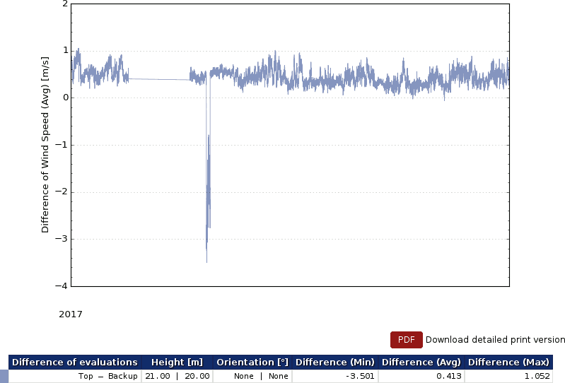
6.1.3.1. Avaliability
The avaliability plot displays in graphical form the values of data avaliability per evaluation.
The data avaliability is a percentage value of the imported data with valid values. If the complete data in a data file for a given period is there, the result is 100%. Every missing value, None or NaN results in decrease of data avaliability. This value is crucial for remote sensors, like LiDARs.
| Important |
|---|---|
Especially for LiDARs a data availability above 95% indicates data with good quality. For LiDAR devices ONLY in this specific plot the 10min Averages, who are below 80%, get filtered and set to Zero. That helps to judge the actual quality of the data set. Everywhere else is the data NOT pre-filtered. So be aware, if you analyse the data with other AmmonitOR Plot tools. Don't confuse Data availability with AmmonitOR's data completeness. Completeness shows, whether all data has arrived, if it is valid or not. Data availability shows the quality of data of LiDAR devices, is it 100% the LiDAR got all 600 mesurement samples in the 10min average. |
Go to the → menu and select in section Distribution the Avaliability plot. Select a data logger from your project, if more than one data logger is related to the project. Select a Evaluation type and choose start and end of the period, which should be displayed. Click on Plot to show the evaluation type avaliability.
Figure 6.19. Example for the avaliability plot with filtered data, means all data samples below 80% were set to zero.
 |
Below the plot, a data table is displayed, listing all evaluations for a chosen type, with the value of their avaliability.
| Tip |
|---|---|
The plot can be shared with other project users, e.g., to inform about any circumstances. Click on Link for sharing this plot. A URL is displayed, which can be copied to an email. |
| Note |
|---|---|
Click on PDF to open a PDF file with the plot. |
6.1.3.2. Average polar
The average polar displays averaged values of an evaluation per wind direction bin and wind speed bin The average polar helps analysing the dependecy of direction and wind speed for the chosen evaluation.
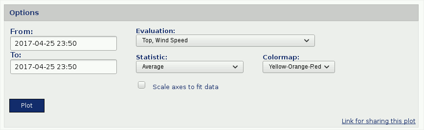
Chose an evaluation to draw a polar graph for a certain time period. Important is to specify the wind direction sectors as well as the wind speed bins for the averaging. The averages are displyaed in form of color map. Different color maps are available to increase the contrast.
Go to the → menu and select in section Distribution the Average polar plot. Select a data logger from your project, if more than one data logger is related to the project. Select a Evaluation type and choose start and end of the period, which should be displayed. Click on Plot to show the evaluation type average polar.
Figure 6.20. Selectable option for the average polar plot
Figure 6.21. Example for the average polar plot
 |
| Tip |
|---|---|
The plot can be shared with other project users, e.g., to inform about any circumstances. Click on Link for sharing this plot. A URL is displayed, which can be copied to an email. |
| Note |
|---|---|
Click on PDF to open a PDF file with the plot. |
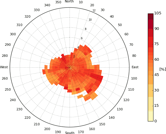
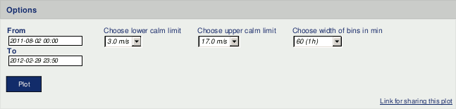
6.1.3.3. Calms analysis
Use this analysis to inspect calm durations on site for defined wind speed limits.
Go to the → menu and select in section Distribution the Calms analysis plot. Select a data logger, if more than one data logger is related to the project. Set lower and upper calm limit.
The lower calm limit indicates the wind speed, at which your wind turbine does not produce energy (not enough wind). The upper calm limit indicates the critical wind speed, at which your wind turbine might stop producing wind energy due to very high wind speed.
Set start and end of the period, which should be analysed. By default AmmonitOR displays 1 hour bins for the calm duration. If required, choose another bin for calm duration.
Figure 6.22. Selectable options for calms analysis
Click on Plot to display the frequency distribution for each wind speed sensor, connected to the selected data logger.
Figure 6.23. Example for calms analysis plot
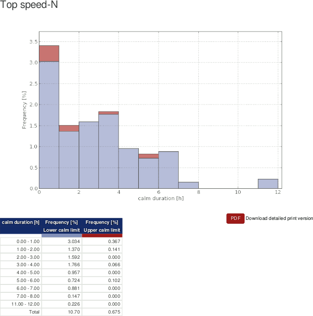 |
Frequencies lower calm limit are displayed in blue color; frequencies upper calm limit are displayed in red color.
| Tip |
|---|---|
The plot can be shared with other project users, e.g., to inform about any circumstances. Click on Link for sharing this plot. A URL is displayed, which can be copied to an email. |
| Note |
|---|---|
Click on PDF to open a PDF file with the plot. |
6.1.3.4. Energy yield
Use this plot to display the energy yield of your wind turbine over a defined period.
The energy yield is calculated as follows:
Equation 6.2. Calculation of Energy Yield
Where Ni refers to the number of hours in bin i and Pi is the averaged power in bin i.
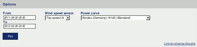
Go to the → menu and select in section Distribution the Energy yield plot. Select a data logger from your project, if more than one data logger is related to the project. Select a Wind speed sensor, the Power curve of your turbine and choose start and end of the period, which should be displayed. Click on Plot to show the energy yield plot.
If no Power curve has been defined, go to the → menu and add a turbine.
Figure 6.24. Selectable option for the energy yield plot
The energy yield of your turbine is displayed in a bar chart with 0.5 m/s wind speed bins.
Figure 6.25. Example for the energy yield plot
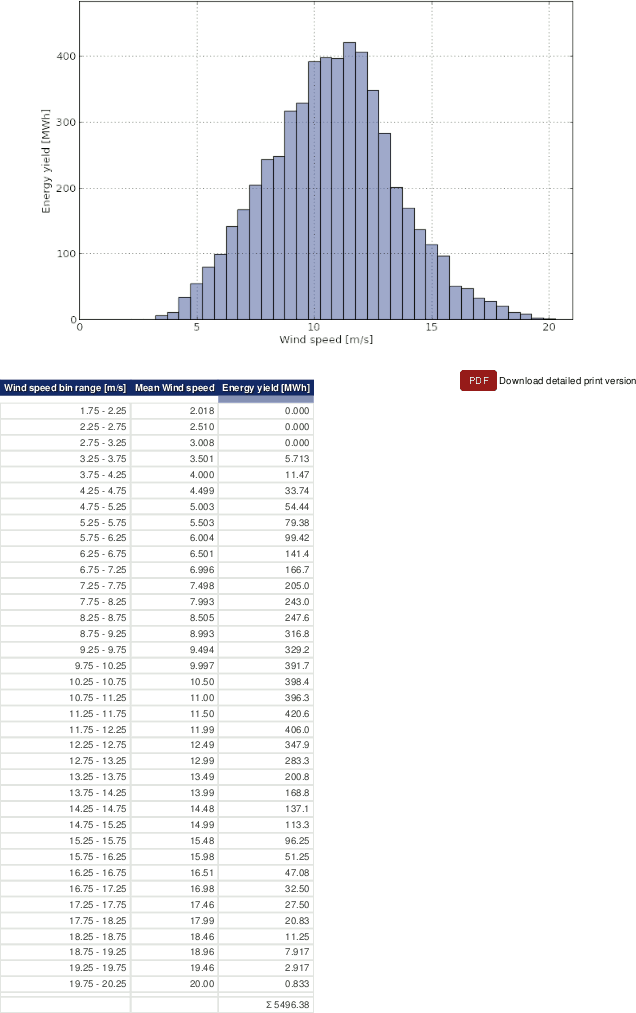 |
Below the plot, a data table is displayed, listing all wind speed bins, the energy yield of your turbine as well as the total energy yield for the selected period.
| Tip |
|---|---|
The plot can be shared with other project users, e.g., to inform about any circumstances. Click on Link for sharing this plot. A URL is displayed, which can be copied to an email. |
| Note |
|---|---|
Click on PDF to open a PDF file with the plot. |
6.1.3.5. Histogram
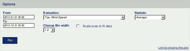
In the Histogram all available evaluations can be displayed to analyse the frequency distribution in selectable bins.
to to the → menu and select in section Distribution the Histogram plot. Select a data logger from the dropdown list and set the time period, which should be displayed. Choose Evaluation, Statistic and Bin width.
Figure 6.26. Options for histogram

Via Plot AmmonitOR calculates the chart.
Figure 6.27. Example: Histogram of wind speed for a determined period
 |
Click on Show data table to display the table, on Hide data table to hide the table.
| Tip |
|---|---|
The plot can be shared with other project users, e.g., to inform about any circumstances. Click on Link for sharing this plot. A URL is displayed, which can be copied to an email. |
| Note |
|---|---|
Click on PDF to open a PDF file with the plot. |
6.1.3.6. Occurrence polar
The occurrence polar displays occurancies of an evaluation per wind direction bin and wind speed bin.
Chose an evaluation to draw a polar graph for a certain time period. Important is to specify the wind direction sectors as well as the wind speed bins for the occurrence calculations. The occurrence are displyaed in form of color map. Different color maps are available to increase the contrast.
Go to the → menu and select in section Distribution the Occurrence polar plot. Select a data logger from your project, if more than one data logger is related to the project. Select a Evaluation type and choose start and end of the period, which should be displayed. Click on Plot to show the evaluation type occurency polar.
Figure 6.28. Selectable option for the occurrence polar plot
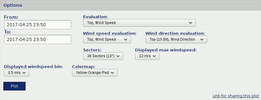
Figure 6.29. Example for the occurrence polar plot
 |
| Tip |
|---|---|
The plot can be shared with other project users, e.g., to inform about any circumstances. Click on Link for sharing this plot. A URL is displayed, which can be copied to an email. |
| Note |
|---|---|
Click on PDF to open a PDF file with the plot. |
6.1.3.7. Speed direction bars
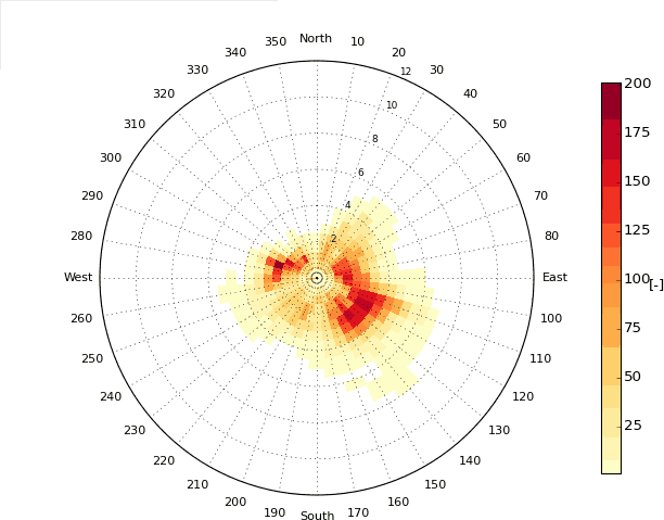
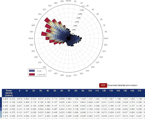
The plot with speed direction bars displays the frequency scale of wind speed and wind direction in a wind rose diagram using coloured bars, which indicate different wind speed bins.
Go to the → menu and select in section Distribution the Speed direction bar plot. Select a data logger and define a period, which should be considered. Choose an evaluation pair and determine the number of sectors in the wind rose diagram.
If no Speed/direction pair has been defined, an information box is shown. Click on Add new evaluation pair and select a wind speed and a wind direction sensor to calculate the evaluation.
Evaluation pairs can also be defined in the → menu. See Section 9.2.2, “Data logger details (Overview)” for further details.
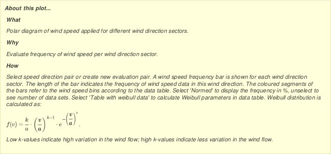
By default Normed is active to display the values in percentage. If the Normed checkbox is ticked off, AmmonitOR shows the frequency; how often a wind speed value of a defined scope has been measured in a wind direction sector according to the selected chart options as numbers.
Select Table with weibull data to see additional weibull data in the data table. AmmonitOR displays a table referring to the chosen sectors. Wind speed average, weibull's a and weibull's k as well as the frequency of every sector are calculated and displayed. Table with weibull data is not selected by default.
Figure 6.30. Options for speed direction bars diagram

Click on Plot to create the diagram.
Figure 6.31. Example: Wind speed and wind direction for a determined period
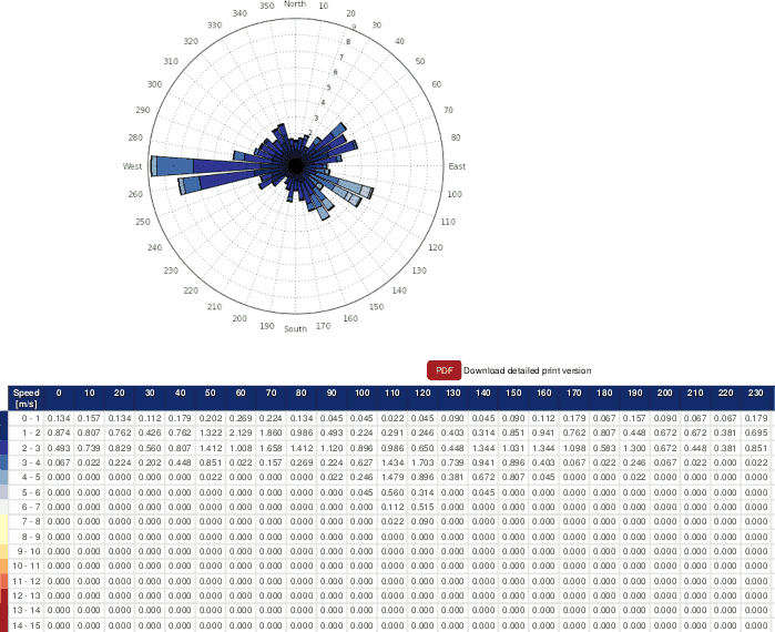 |
The plot shows a wind rose with coloured bars, which indicate how often a wind speed has been measured for a wind direction sector. The colours indicate the value in m/s. Refer to the data table below the plot for the wind speed bin related to the colour shown in the wind rose.
Click on Show data table to display the table, on Hide data table to hide the table.
| Tip |
|---|---|
The plot can be shared with other project users, e.g., to inform about any circumstances. Click on Link for sharing this plot. A URL is displayed, which can be copied to an email. |
| Note |
|---|---|
Click on PDF to open a PDF file with the plot. |
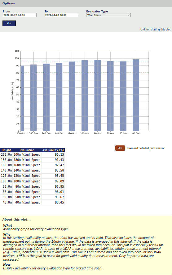
6.1.3.8. Speed direction dots
The speed direction dots diagram displays the frequency scale of wind speed and wind direction data for a determined period in a wind rose diagram.
Go to the → menu and select in section Distribution the Speed direction dots plot. Select a data logger and define a period, for which should be displayed. Choose an evaluation pair and determine the number of sectors in the wind rose diagram.
If no Speed/direction pair has been defined, an information box is shown. Click on Add new evaluation pair and select a wind speed and a wind direction sensor to calculate the evaluation.
Evaluation pairs can also be defined in the → menu. See Section 9.2.2, “Data logger details (Overview)” for further details.
Figure 6.32. Options for speed direction dots diagram

Click on Plot to create the speed direction dots diagram.
Figure 6.33. Example: Wind speed and wind direction for a determined period
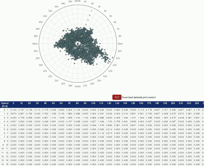 |
The measurement values are displayed in a wind rose. The higher the wind speed the farther away are the dots from the center of the wind rose diagram. The wind speed is indicated on a scale (0m/s is in the center of the wind rose diagram).
AmmonitOR lists the frequency of measurement values in percentage; how often a wind speed value of a defined scope has been measured in a wind direction sector according to the selected chart options. Click on Show data table to display the table, on Hide data table to hide the table.
| Tip |
|---|---|
The plot can be shared with other project users, e.g., to inform about any circumstances. Click on Link for sharing this plot. A URL is displayed, which can be copied to an email. |
| Note |
|---|---|
Click on PDF to open a PDF file with the plot. |
6.1.3.9. Wind direction
The wind direction plot displays the frequency scale of wind directions in a wind rose diagram. AmmonitOR displays for each wind direction sensor a separate wind rose diagram.
Go to the → menu and select in section Distribution the Wind direction plot. Select a data logger from the project and determine the period, which should be monitored. Choose the number of sectors for the wind rose diagram.
By default Normed is active and the frequency is displayed in percentage. If you deselect the Normed checkbox, the frequency of measurement data is displayed.
Figure 6.34. Options for wind rose diagram

Click on Plot to generate the wind rose diagram(s).
Figure 6.35. Example: Wind rose for a determined period
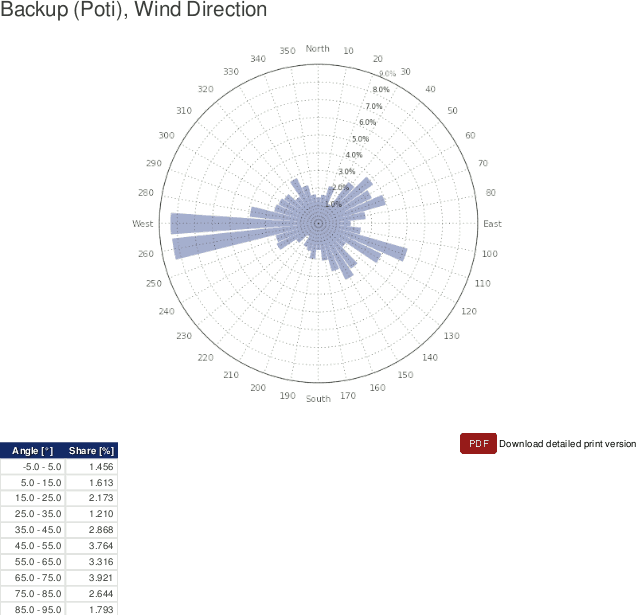 |
| Tip |
|---|---|
The plot can be shared with other project users, e.g., to inform about any circumstances. Click on Link for sharing this plot. A URL is displayed, which can be copied to an email. |
| Note |
|---|---|
Click on PDF to open a PDF file with the plot. |
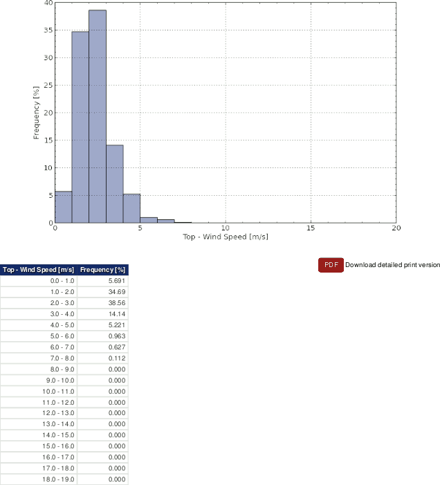
6.1.3.10. Wind speed
AmmonitOR displays the frequency scale of all installed wind speed sensors in histograms. Weibull parameters can be displayed. The distribution of measurement values are calculated in 0.5 m/s bins.
Figure 6.36. Options for wind speed histogram
Go to the → menu and select in section Distribution the Wind speed plot. Select a data logger from the project and determine the period, which should be monitored. Click on Plot to display for each wind speed sensor a histogram with Weibull curve and Weibull parameters.
Figure 6.37. Histogram of wind speed
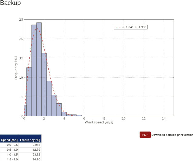 |
Weibull parameters are calculated using the Modified Maximum Likelihood Estimation algorithm.
Equation 6.3. Calculation of weibull shape parameter
Equation 6.4. Calculation of weibull scale parameter
The first equation (shape parameter) is estimated using iterative processes with a precision of ±0.0001, the scale parameter is derived from the estimated shape parameter using the second equation.
For each wind speed sensor, AmmonitOR lists the frequency for all 0.5 m/s bins in a data table below the histograms. Click on Show data table to display the table, on Hide data table to hide the data table.
| Tip |
|---|---|
The plot can be shared with other project users, e.g., to inform about any circumstances. Click on Link for sharing this plot. A URL is displayed, which can be copied to an email. |
| Note |
|---|---|
Click on PDF to open a PDF file with the plot. |
6.1.4. Comparison
This section lists all plots, which correlate or compare measurement values.
6.1.4.1. Correlation occurrence plot
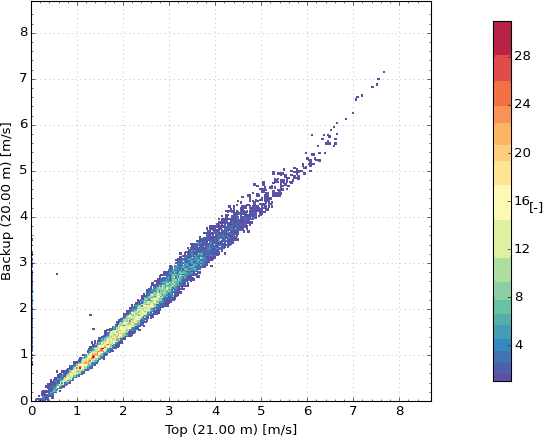
The correlation occurrency plot is used to compare measurement values (evaluations) of the same sensor type, e.g., anemometers. Thus measurement errors or defective sensors can easily be detected. In addition to the correlation plot the occurrency is displayed. For detailed explanations go to Section 6.1.4.2, “Correlation plot”.
Go to the → menu and select in section Comparison the Correlation occurency plot. Select a data logger and define the period, which should be considered for the plot. Choose an Evaluation type from the dropdown list. AmmonitOR automatically includes all sensors of the evaluation type in the plot. Deselect sensors, which should not be displayed in the correlation profile by using the CTRL key. Click on Plot to display the correlation occurency profile.
Figure 6.38. Selectable options for correlation occurency plot
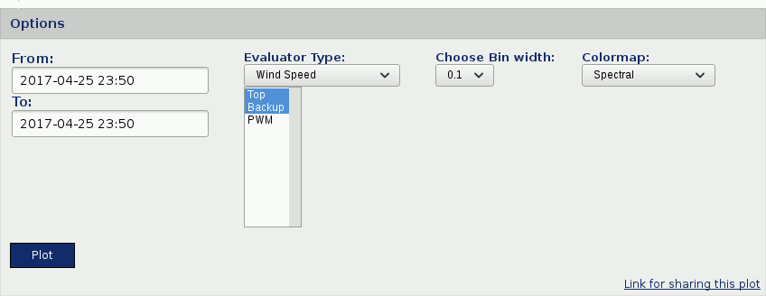
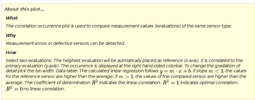
Figure 6.39. Correlation occurrence profile for wind direction
 |
| Tip |
|---|---|
The plot can be shared with other project users, e.g., to inform about any circumstances. Click on Link for sharing this plot. A URL is displayed, which can be copied to an email. |
| Note |
|---|---|
Click on PDF to open a PDF file with the plot. |
| Important |
|---|---|
Depending on the installation height of the correlated sensors, the gradient angle of the regression line is different. This is because of atmospheric layers. It affects all height-dependent sensors, e.g., anemometers, temperature sensors and air pressure sensors. |
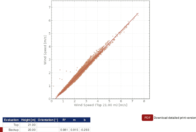
6.1.4.2. Correlation plot
The correlation plot is used to compare measurement values (evaluations) of the same sensor type, e.g., anemometers. Thus measurement errors or defective sensors can easily be detected.
One sensor is used as reference. AmmonitOR automatically selects the sensor with the greatest installation height as reference, it indicated. The reference sensor is shown on x-axis; other sensors on the y-axis. For example: top anemometer on x-axis and backup anemometer on y-axis. All measurement values are displayed in a data cluster - optimally on a diagonal.
AmmonitOR calculates a regression line for each correlation, which is displayed in the plot. Thus the trend of the measurement values can be monitored.
The regression line is calculated as follows:
Equation 6.5. Calculation of regression line and coefficient of determination R²
Go to the → menu and select in section Comparison the Correlation plot. Select a data logger and define the period, which should be considered for the plot. Choose an Evaluation type from the dropdown list. AmmonitOR automatically includes all sensors of the evaluation type in the plot. Deselect sensors, which should not be displayed in the correlation profile by using the CTRL key. Click on Plot to display the correlation profile.
Figure 6.40. Selectable options for correlation profile
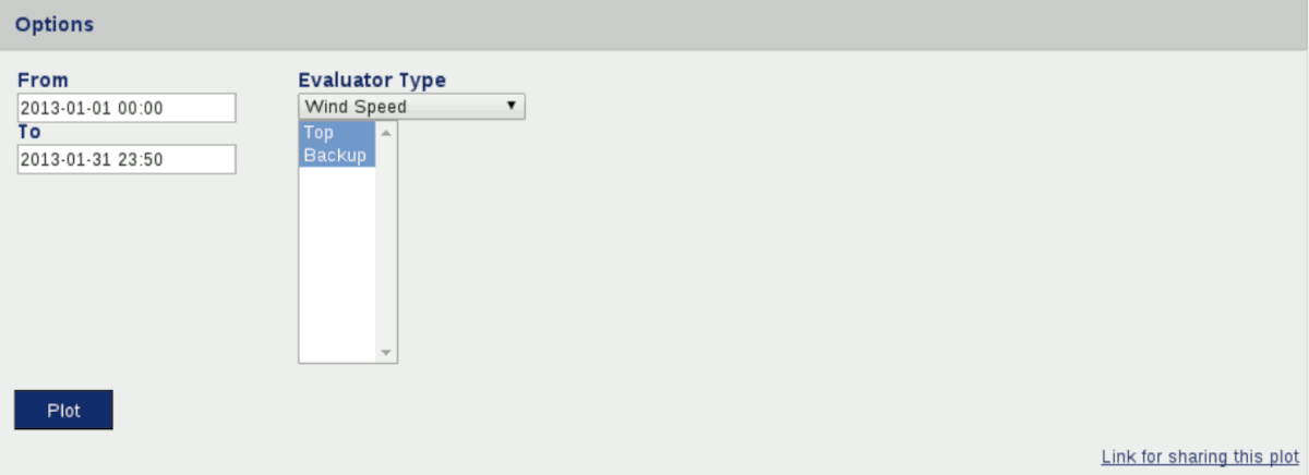
Figure 6.41. Correlation profile for wind direction
 |
| Tip |
|---|---|
The plot can be shared with other project users, e.g., to inform about any circumstances. Click on Link for sharing this plot. A URL is displayed, which can be copied to an email. |
| Note |
|---|---|
Click on PDF to open a PDF file with the plot. |
The explanation next to the diagram (see
Figure 6.41, “Correlation profile for wind direction”) indicates, which regression
line corresponds to the correlated sensor. The coefficient of determination
R² indicates the linear correlation.
R² = 1 means optimal correlation;
R² = 0 indicates no linear correlation.
| Important |
|---|---|
Depending on the installation height of the correlated sensors, the gradient angle of the regression line is different. This is because of atmospheric layers. It affects all height-dependent sensors, e.g., anemometers, temperature sensors and air pressure sensors. |
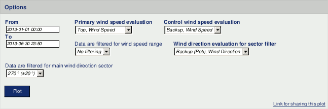
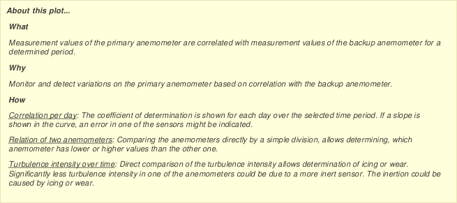
6.1.4.3. Long term comparison profile
The long term comparison profile is used to monitor and detect wear on the top anemometer based on the correlation with the backup anemometer. For a determined period measurement values of the top anemometer are correlated with measurement values of the backup anemometer.
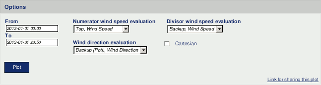
Go to the → menu and select in section Comparison the Long term comparison profile. Select primary and backup wind speed evaluations, which should be correlated. Select a wind direction evaluation.
Wind speed data can be filtered to monitor only a typical wind speed range. Additionally, wind speed data related to a determined wind direction sector can be considered. To do so, select the filter for wind speed and / or wind direction.
Figure 6.42. Options for long term comparison profile
AmmonitOR displays three plots: correlation per day, relation of the chosen anemometers and turbulence intensity over time.
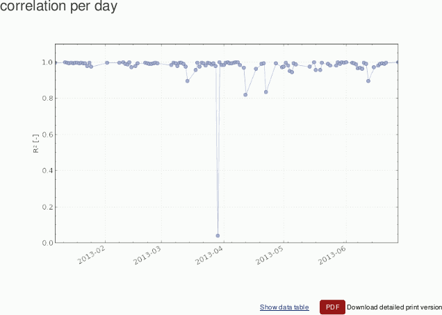
- Correlation per day
AmmonitOR displays the correlation of the selected wind speed sensors per day. The behaviour of the R² can be monitored for the determined period. Optimal correlation would be R² close to 1.
Figure 6.43. Correlation of selected anemometers per day
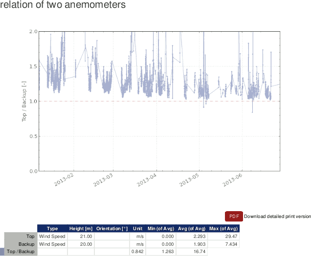
- Relation of chosen anemometers
The division result of the selected top and backup anemometers is displayed in a curve. If the top anemometer is slower than the backup anemometer, the displayed curve is below the optimal value 1. This plot indicates the defective anemometer.
In a table the total minimum, average and maximum measurement values of the selected anemometers are displayed (based on the calculated averages), as well as the values for the displayed curve.
Figure 6.44. Relation of selected anemometers
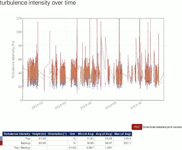
- Turbulence intensity over time
AmmonitOR displays the turbulence intensity of both anemometers in a plot. If the turbulence intensity of one anemometer is much higher than the other, a defective anemometer can be the reason.
The turbulence intensity is the proportion of standard deviation and average of the 10min statistics over a certain period. The value is given in percentage.
A table shows the minimum, average and maximum value of the turbulence intensity of the selected anemometers.
Figure 6.45. Turbulence intensity for selected anemometers
| Tip |
|---|---|
The plot can be shared with other project users, e.g., to inform about any circumstances. Click on Link for sharing this plot. A URL is displayed, which can be copied to an email. |
| Note |
|---|---|
Click on PDF to open a PDF file with the plot. |
6.1.4.4. Shadow zone plot
Generate this plot to display shadow zones caused by the mast or lightning
protection. AmmonitOR shows the wind direction by calculating the quotient [
q] of two anemometers. The generated chart shows a bulge in the
direction of the mast, lightning protection or obstacle.
The shadow zone is calculated as follows:
Equation 6.6. Calculation of shadow zone
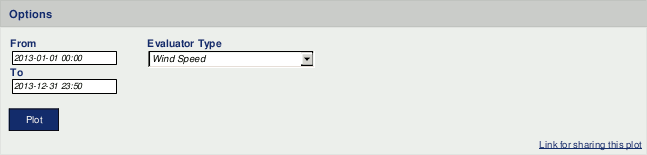
Go to the → menu and select in section Comparison the Shadow zone plot. Select a data logger and determine the period, which should be displayed. Choose wind speed sensors and a wind vane. The numerator should be the top anemometer and the divisor the backup anemometer. However, it is possible to compare other anemometers installed on different heights - according to literature the height difference should not exceed 5m.
Figure 6.46. Options for shadow zone plot
Click on Plot to create the shadow zone diagram.
Figure 6.47. Example: Shadow zone plot
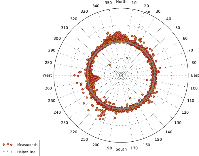 |
In order to show the shadow zone plot in a cartesian chart, select Cartesian.
| Tip |
|---|---|
The plot can be shared with other project users, e.g., to inform about any circumstances. Click on Link for sharing this plot. A URL is displayed, which can be copied to an email. |
| Note |
|---|---|
Click on PDF to open a PDF file with the plot. |
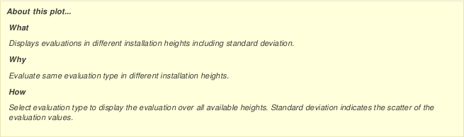
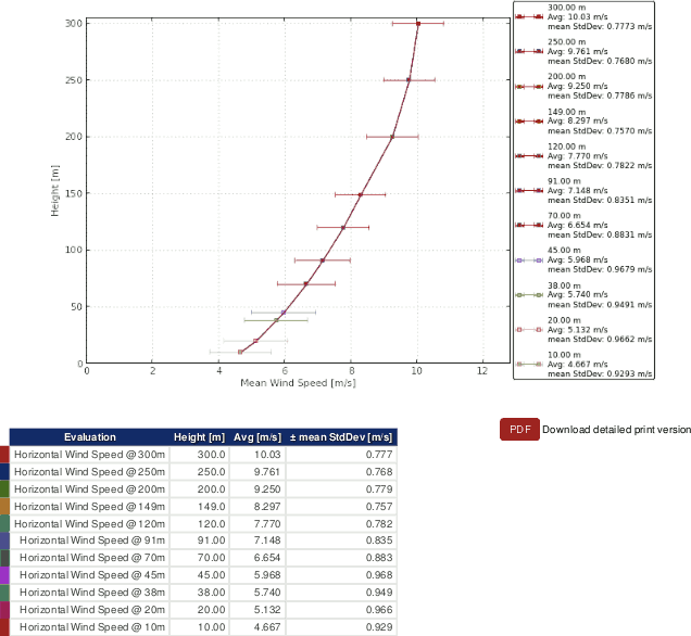
6.1.4.5. Simple height profile
The simple height profile is used to compare evaluations in different installation heights. AmmonitOR displays the average values including standard deviation of an evaluation for a determined period.
Go to the → menu and select in section Comparison the Simple height profile. Select a data logger and determine the period, which should be displayed. Choose an Evaluation type, for which all installed sensors are shown in the plot.
Click on Plot to display the diagram.
Figure 6.48. Options: Simple height profile
For example: If the simple height profile for wind speed should be displayed, AmmonitOR shows for each installed anemometer a graph.
Figure 6.49. Example: Simple height profile for wind speed
 |
| Tip |
|---|---|
The plot can be shared with other project users, e.g., to inform about any circumstances. Click on Link for sharing this plot. A URL is displayed, which can be copied to an email. |
| Note |
|---|---|
Click on PDF to open a PDF file with the plot. |
6.1.5. Soiling measurement
This section lists all plots, which display all relevant soiling information.
6.1.5.1. Soiling Ratio
The soiling ratio plot displays three plots, who are relevant to get the full picture of soiling ratio. According to IEC 61724-1:2021 the daily soiling ratio is a weighted average build from measurements between 10:00 and 14:00 local time. The first plot Daily soiling ratio (Weighted Avg) will display this values by taking the selected Soiling Ratio evaluation into account.
Daily soiling ratio plot also shows the count of soiling ratio evaluation to make visible the amount of used data points to calculate the daily weighted average.
To understand what the measured soiling ratio influences the Irradiance and Soiling ratio plot displays clean and soiled irradiance evaluations, who needs to be selected through the drop down menu, clean irradiance evaluation and soiled irradiance evaluation. The soiling ratio evaluation is also displayed, but without filtering nor weightening.
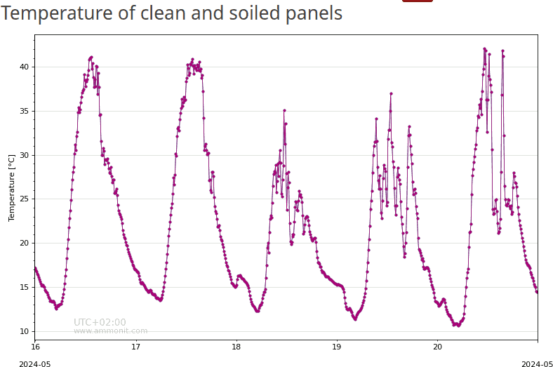
Relevant to judge soiling ratio values measured by a two solar panel system are also the temperature values of both modules. Those are displayed in the third plot Temperature of clean and soiled panels. Therefore the related temperature evaluations have to be selected throught the two drop down menues. One is for the clean and one for the soiled temperature evaluation
Go to the → menu and select in section Soiling measurement the Soiling Ratio. Select a data logger and define the period, which should be considered for the plot.
Figure 6.50. Weighted soiling ratio
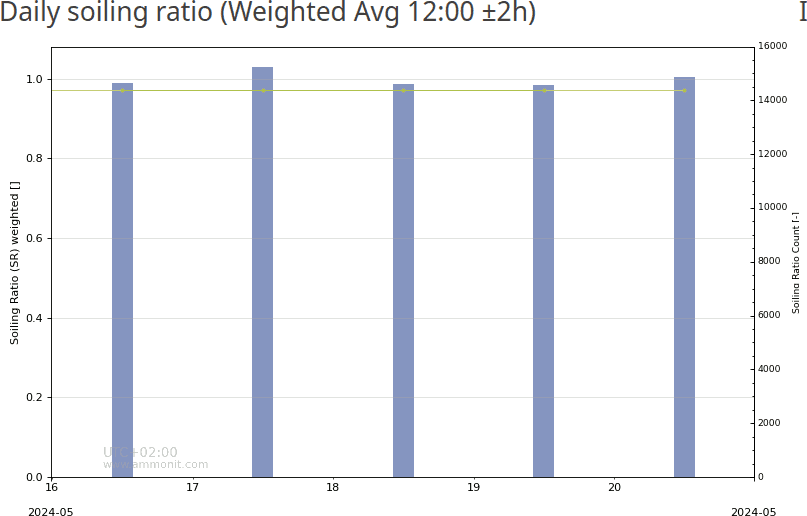 |
Figure 6.51. Soiling ratio and effective irradiance
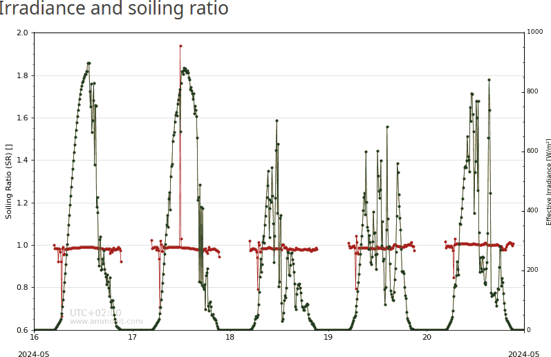 |
Figure 6.52. Temperature of soiled and clean solar panels
 |
| Tip |
|---|---|
The plot can be shared with other project users, e.g., to inform about any circumstances. Click on Link for sharing this plot. A URL is displayed, which can be copied to an email. |
| Note |
|---|---|
Click on PDF to open a PDF file with the plot. |
6.1.5.2. Soiling Loss Index
The Soiling Loss Index is compareable to Soiling Ratio and shows Section 6.1.5.2, “Soiling Loss Index”.
Go to the → menu and select in section Soiling measurement the Soiling Loss Index. Select a data logger and define the period, which should be considered for the plot. Choose an Evaluation type from the dropdown list. AmmonitOR automatically includes all sensors of the evaluation type in the plot. Deselect sensors, which should not be displayed in the correlation profile by using the CTRL key. Click on Plot to display the correlation occurency profile.
Figure 6.53. Daily soiling Loss Index (weighted)
 |
| Tip |
|---|---|
The plot can be shared with other project users, e.g., to inform about any circumstances. Click on Link for sharing this plot. A URL is displayed, which can be copied to an email. |
| Note |
|---|---|
Click on PDF to open a PDF file with the plot. |
6.1.5.3. XY Soiling Profile
The XY soiling profile provides all relevant soiling evaluations and their support evaluations to be displayed in an classic XY plot.
Go to the → menu and select in section Soiling measurement the XY Soiling profile. Select soiling evaluations, which should be displayed. To get additional information to your soiling situation select support evaluations like temperature or effective irradiance evaluations. Optional the statistics can be selected to show e.g. the count of the measurement.
| Tip |
|---|---|
The plot can be shared with other project users, e.g., to inform about any circumstances. Click on Link for sharing this plot. A URL is displayed, which can be copied to an email. |
| Note |
|---|---|
Click on PDF to open a PDF file with the plot. |
6.1.6. Turbulence analysis
This section lists typical plots relevant for turbulence analysis.
6.1.6.1. Turbulence intensity
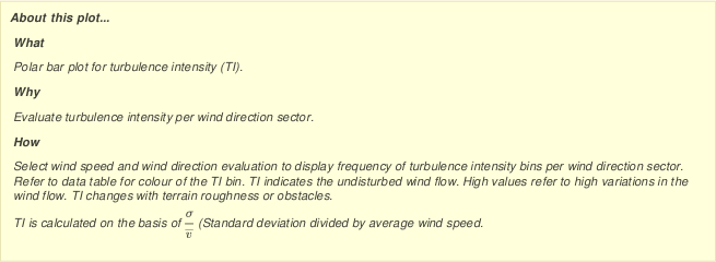
Turbulence intensity is crucial for the wind turbine design, especially to calculate the wind load on the rotor blades and on the tower. It does not necessarily have an impact on the energy yield.
Horizontal and vertical wind speed data is necessary to calculate the turbulence intensity. It is recommended installing a propeller anemometer to measure the vertical wind speed in addition to cup anemometers (horizontal wind speed). Ultrasonic anemometers can also be installed, which measure horizontal and vertical wind speed as well as wind direction.
The average turbulence intensity
(Iv) is given in
% (percentage). The turbulence intensity is the proportion of
standard deviation (σ) and average (v) of the 10min-statistics for a certain
period.
Equation 6.7. Calculation of the turbulence intensity (Iv)
Equation 6.8. Calculation of the characteristical turbulence intensity (I c)
Equation 6.9. Calculation of the Normal Turbulence Model (NTM) of IEC61400-1
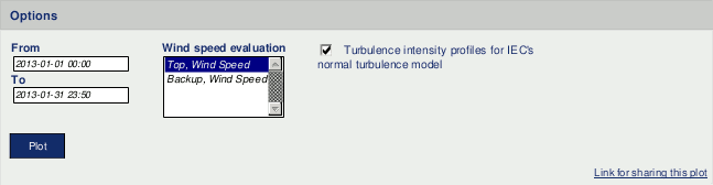
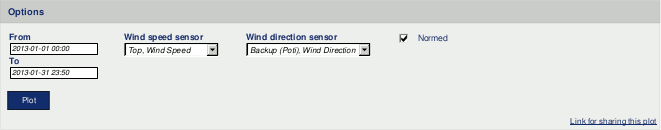
Go to the
→ menu and select in section
Turbulence analysis the
Turbulence intensity plot. Select a data logger from the project
and determine the period, which should be monitored. Choose a wind speed evaluation. If
more than one wind speed evaluation should be displayed, hold the
CTRL key and use the left-mouse click to choose further evaluations.
Click on
Plot to display the chart.
By selecting the checkbox Turbulence intensity profile for IEC's normal turbulence model, curves of the normal turbulence model are displayed in the diagram, see Figure 6.57, “Example: Mean and characteristic turbulence intensity”.
Figure 6.54. Options for turbulence intensity plots
AmmonitOR generates four plots to monitor turbulence intensity.
Figure 6.55. Example: Turbulence intensity frequency scale
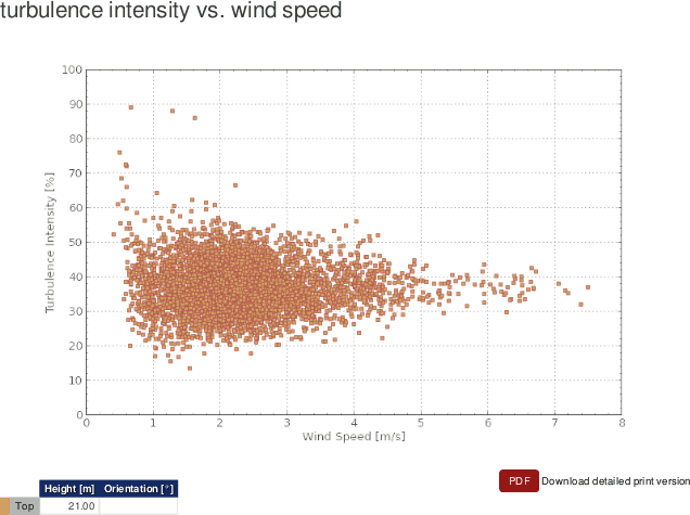 |
Figure 6.55, “Example: Turbulence intensity frequency scale” displays the frequency scale of the turbulence intensity on the wind speed.
Figure 6.56. Example: Turbulence intensity vs. installation height
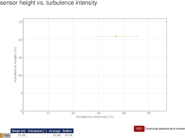 |
Figure 6.56, “Example: Turbulence intensity vs. installation height” displays the turbulence intensity of the selected wind speed sensor on the different installation heights.
Figure 6.57. Example: Mean and characteristic turbulence intensity
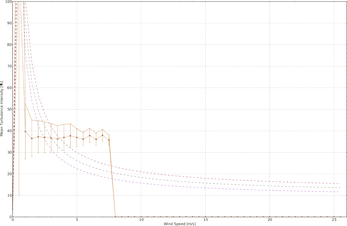 |
Figure 6.57, “Example: Mean and characteristic turbulence intensity” displays the mean and characteristic turbulence intensity of the selected sensor.
AmmonitOR lists for each wind speed bin average and standard deviation of the wind speed. Click on Show data table to review the data, on Hide data table to hide the data table.
Figure 6.58. Example: Turbulence intensity trend
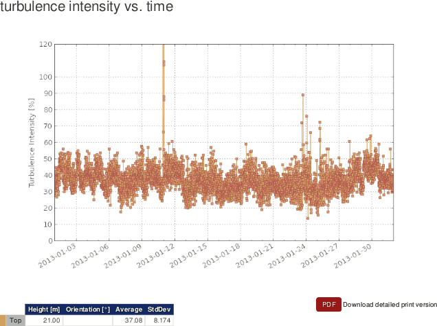 |
Figure 6.58, “Example: Turbulence intensity trend” displays the trend of the turbulence intensity for the selected period.
| Tip |
|---|---|
The plot can be shared with other project users, e.g., to inform about any circumstances. Click on Link for sharing this plot. A URL is displayed, which can be copied to an email. |
| Note |
|---|---|
Click on PDF to open a PDF file with the plot. |
6.1.6.2. Turbulence intensity polar
The turbulence intensity polar displays the frequency scale of the turbulence intensity in a wind rose plot.
Go to the → menu and select in section Turbulence analysis the Turbulence intensity polar plot. Select a data logger from the project and determine the period, which should be monitored. Choose a wind speed and a wind direction evaluation from the list. Click on Plot to display the wind rose diagram.
Figure 6.59. Options for turbulence intensity polar
By default Normed is active and the frequency of measurement values is displayed in percentage. If you deselect the Normed checkbox, AmmonitOR displays the frequency of the measurement values in numbers.
Figure 6.60. Example: Turbulence intensity polar
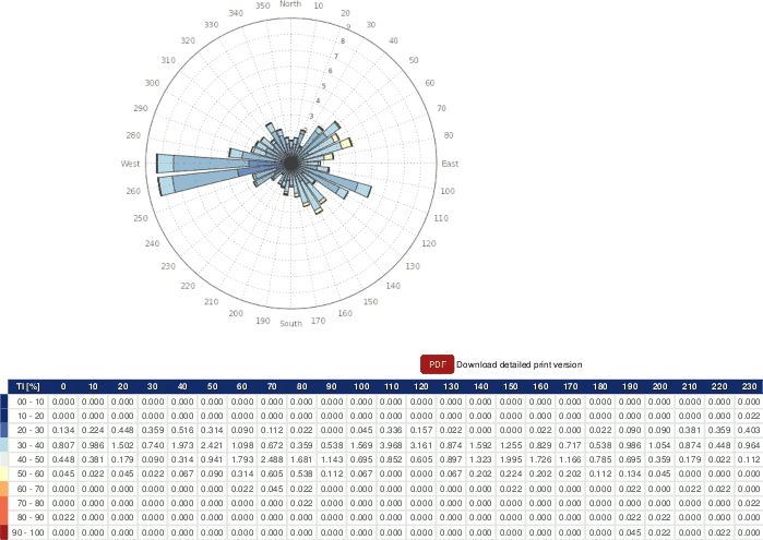 |
The turbulence intensity in the different wind direction sectors is highlighted according to a colour scale. The colours are indicated in the data table below the diagram. AmmonitOR lists for each wind direction sector (10°) the frequency of turbulence intensity in 10% bins.
| Tip |
|---|---|
The plot can be shared with other project users, e.g., to inform about any circumstances. Click on Link for sharing this plot. A URL is displayed, which can be copied to an email. |
| Note |
|---|---|
Click on PDF to open a PDF file with the plot. |
6.1.7. Power curve measurement
This section lists a number of plots relevant for power curve measurement
applications. In order to display the plots in this section,
Speed/power pairs and power measuring units, e.g., power meters, are
required.
6.1.7.1. Energy yield
Use this plot to display the calculated energy yield of your wind turbine over a defined period. Additionally, a reference wind turbine can be added to the plot to compare the energy yield of your turbine with the energy yield of the reference turbine.
The energy yield is calculated as follows:
Equation 6.10. Calculation of Energy Yield
WhereNi refers to the number of hours in bin i and Pi is the averaged power in bin i.
Go to the → menu and select in section Power curve measurement the Energy yield plot. Select a data logger from your project, if more than one data logger are related to the project. Select a Speed/power pair and choose start and end of the period, which should be displayed. Optionally, a Power curve can be included in the plot - select one from the dropdown list. Click on Plot to show the energy yield plot.
If no Speed/power pair has been defined, a red-colored information box is displayed. Click on Add new evaluation pair and select a wind speed sensor and a power measuring unit (power meter) to calculate the evaluation for the energy yield. It is possible to create more than on Speed/power pair.
Evaluation pairs can also be defined in the → menu. See Section 9.2.2, “Data logger details (Overview)” for further details.
If no Power curve has been defined, go to the → menu and add a wind turbine.
Figure 6.61. Selectable option for the energy yield plot
The energy yield of your turbine is displayed in blue bars. If selected, the energy yield of the reference wind turbine is displayed in red bars.
Figure 6.62. Example for the energy yield plot
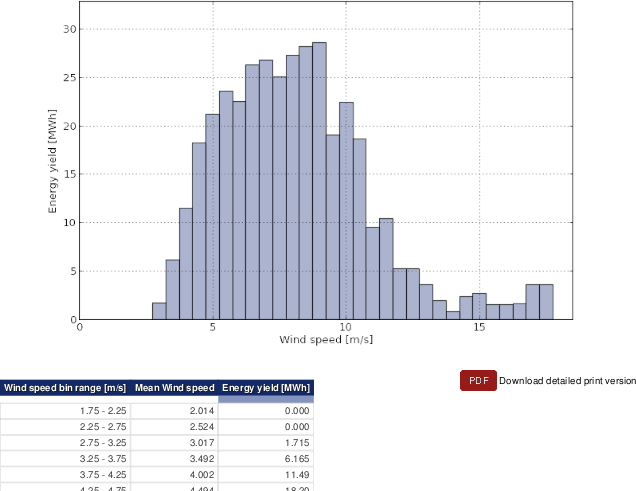 |
Below the plot, a data table can be displayed by clicking on Show data table. AmmonitOR lists for all wind speed bins the energy yield of your turbine as well as the total enery yield for the selected period. Additionally, AmmonitOR lists the mean wind speed per wind speed bin. If a wind turbine has been selected for comparison reasons, the table list all values of the turbine in a separate column.
| Tip |
|---|---|
The plot can be shared with other project users, e.g., to inform about any circumstances. Click on Link for sharing this plot. A URL is displayed, which can be copied to an email. |
| Note |
|---|---|
Click on PDF to open a PDF file with the plot. |
6.1.7.2. Estimated energy yield
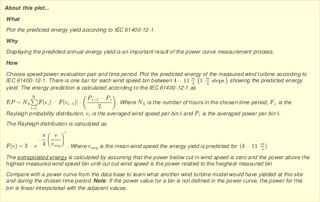
In order to estimate the energy yield according to IEC 61400-12-1 a number of measurement values have to be collected. Use this plot to predict the annual energy yield based on wind speed and power curve data for a specified time period.
By setting the Operational range of the turbine, the extrapolated energy yield per wind speed bin is displayed in the plot. The measurement data is extrapolated to display the maximum achieveable energy yield per wind speed bin. According to IEC 61400-12-1 a number of measurement values have to be available to confirm the calculation. Areas with missing measurement values are highlighted in the plot.
Additionally, a reference turbine can be included in the plot to compare its data with your turbine.
According to IEC 61400-12-1 the energy yield forecast is calculated as follows:
Equation 6.11. Calculation of Energy Yield Forecast acc. to IEC 61400-12-1
Where N h represents the number of hours in the chosen time period, F v is the Rayleigh probability distribution, v i is the averaged wind speed per bin i and P i is the averaged power per bin i.
The Rayleigh distribution is calculated as follows:
Equation 6.12. Calculation of Rayleigh distribution
Where v avg is the mean wind speed the energy yield is predicted for (4−11 m/s).
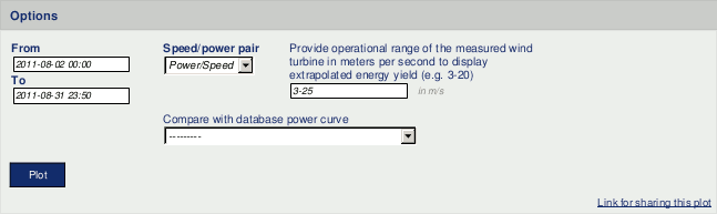
Go to the
→ menu and select in section
Power curve measurement the
Estimated energy yield plot. Select a data logger from the
dropdown list and choose a
Speed/power pair. Set start and end of the period, which should be
displayed. Enter the
Operational range of your turbine with cut-in and cut out. Use a
hyphen (
-) to separate the values, e.g., 3-20.
If no Speed/power pair has been defined, a red-colored information box is displayed. Click on Add new evaluation pair and select a wind speed sensor and a power measuring unit (power meter) to calculate the evaluation for the energy yield. It is possible to create more than on Speed/power pair.
Evaluation pairs can also be defined in the → menu. See Section 9.2.2, “Data logger details (Overview)” for further details.
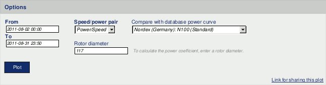
If a reference turbine should be included in the plot, choose a turbine from the list under Compare with database power curve. The selected reference turbine will be displayed with red-colored bars in the plot. If no reference turbine has been defined, go to the → menu and add the required turbine data.
Figure 6.63. Selectable option for the estimated energy yield plot
Click on Plot to show the estimated energy yield plot.
Figure 6.64. Example for the estimated energy yield plot
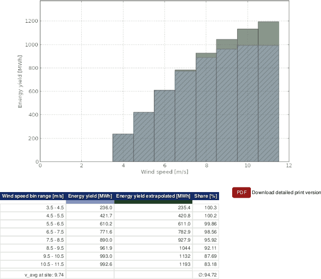 |
Below the plot, a data table is displayed. AmmonitOR lists for all wind speed bins the estimated energy yield. If a reference turbine has been selected, AmmonitOR lists also the energy yield of the reference turbine per wind speed bin.
If the Operational range of the turbine has been entered, AmmonitOR displays the extrapolated values and its share referring to the number of values available for the energy yield calculation in the table.
| Tip |
|---|---|
The plot can be shared with other project users, e.g., to inform about any circumstances. Click on Link for sharing this plot. A URL is displayed, which can be copied to an email. |
| Note |
|---|---|
Click on PDF to open a PDF file with the plot. |
6.1.7.3. Power curve
Use this plot to display the power curve and optionally the power coefficient of your turbine. AmmonitOR generates a number of wind speed bins in 0.5 m/s steps according to IEC 61400-12-1. For each wind speed bin, the power is calculated and displayed. Additionally, a reference turbine can be added to the graph to compare the values.
The power per wind speed bin is calculated according IEC 61400-12-1:
Equation 6.13. Calculation of the power curve per wind speed bin acc. to IEC 61400-12-1
Where Ni is the number of used 10 minute datasets per bin i. j is the dataset of the chosen time period. Pi,j stands for all power data in bin i in the dataset j.
If the Rotor diameter of the turbine has been entered, AmmonitOR calculates the power coefficient also according IEC 61400-12-1:
Equation 6.14. Calculation of the power coefficient acc. to IEC 61400-12-1
Where ρ 0 is the air density at 15°C (1.225kg/m³), A is the swept area and v i is the mean wind speed in bin i that is calculated as:
Equation 6.15. Calculation of the mean wind speed
Go to the → menu and select in section Power curve measurement the Power curve plot. Select a data logger from the list and set start and end of the period, which should be shown in the graph. Select a Speed/power pair from the list. Optionally, a reference power curve can be added to the plot.
If no Speed/power pair has been defined, a red-colored information box is displayed. Click on Add new evaluation pair and select a wind speed sensor and a power measuring unit (power meter) to calculate the evaluation. It is possible to create more than on Speed/power pair.
Evaluation pairs can also be defined in the → menu. See Section 9.2.2, “Data logger details (Overview)” for further details.
If no Power curve has been defined, go to the → menu and add a wind turbine.
Optionally the Rotor diameter (in m) of the wind turbine can be entered to display the Power coefficient.
In order to compare your wind turbine with a reference turbine, choose a turbine from the list. The reference values are displayed in red color in the graph.
Figure 6.65. Options for the power curve graph
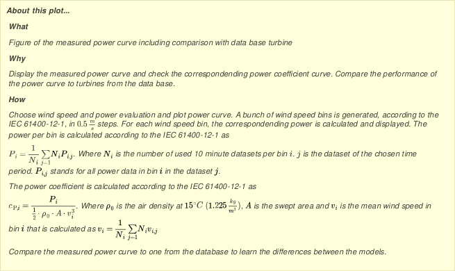
Click on Plot to display the power curve graph.
Figure 6.66. Example of the power curve graph
 |
| Tip |
|---|---|
The plot can be shared with other project users, e.g., to inform about any circumstances. Click on Link for sharing this plot. A URL is displayed, which can be copied to an email. |
| Note |
|---|---|
Click on PDF to open a PDF file with the plot. |
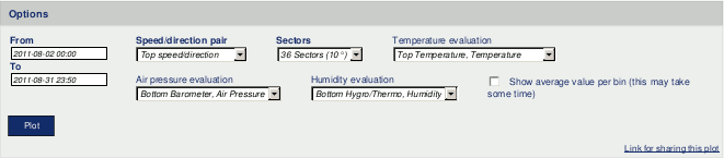
6.1.7.4. Wind power density
Use this plot to display the wind power density at your site. For each wind direction bin, the potential energy of the wind flow is calculated and displayed in a polar plot. Depending on the available evaluations, the calculation method differs as follows:
If there is at least a wind speed evaluation, the wind power density is calculated as:
Equation 6.16. Calculation of the wind power density with wind speed evaluation (the air density is assumed as 1.225 kg / m 3
Where ρ is the air density and v is the wind speed.
If there is a temperature evaluation and a air pressure evaluation available, the wind power density is calculated as follows:
Equation 6.17. Calculation of the wind power density with wind speed-, temperature- and air pressure evaluation
Where B is the air pressure, R 0 is the gas constant of dry air (287.05 J/kgK) and T is the absolute temperature.
If there is additionally a humidity evaluation available, the wind power density is calculated as follows:
Equation 6.18. Calculation of the wind power density with wind speed-, temperature-, air pressure- and humidity evaluation acc. to IEC 61400-12-1
Where φ is the humidity, PbW is the vapor pressure (0.0000205 · e0.0613846 · T), RW is the gas constant of water vapor (461.5 J/kgK).
Go to the → menu and select in section Power curve measurement the Wind power density plot. Select a data logger from the list and set start and end of the period, which should be shown in the graph. Select the shown evaluations from the lists.If a evaluation is not available, it's not displayed'. If the mean value for the wind power density per bin is desired, Show average value per bin has to be selected. The calculation of this mean value can take some time.
Figure 6.67. Options for the wind power density graph
Click on Plot to display the wind power density graph.
Figure 6.68. Example of the wind power density graph
 |
| Tip |
|---|---|
The plot can be shared with other project users, e.g., to inform about any circumstances. Click on Link for sharing this plot. A URL is displayed, which can be copied to an email. |
| Note |
|---|---|
Click on PDF to open a PDF file with the plot. |
6.2. Table of Statistics
In the → the following options are avaliable: Wind speed data analysis and Averages per month.
6.2.1. Wind speed data analysis
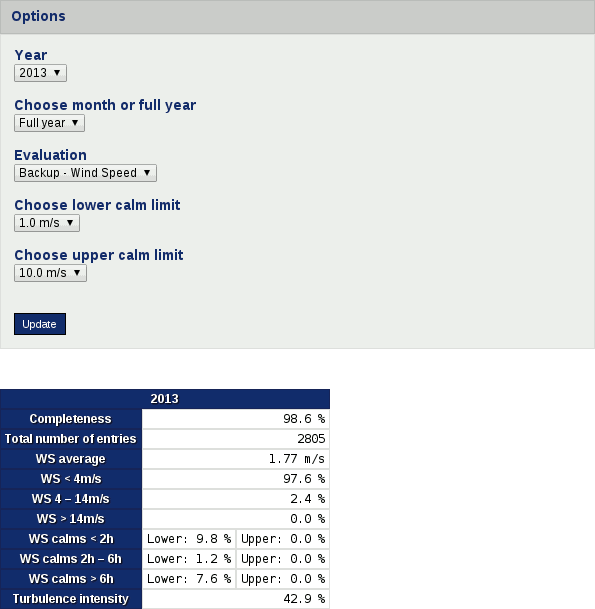
Wind speed data analysis is created specifically for wind speed evaluator inspection. It shows the general project completeness, total number of entries, average wind speed, percentage of wind speed values in specific ranges, wind calms occurance and average tubulence intensity. The period can be specified as a particular month or as a full year.
It requires specification of Year, Month or full year, Evaluation, Lower calm limit, Upper calm limit.
Figure 6.69. Wind speed data analysis table
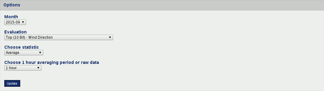
6.2.2. Averages per month
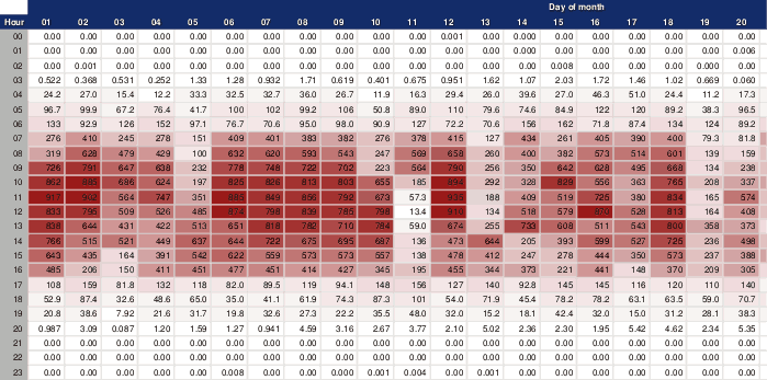
The table of averages displays the data for a selected month, evaluator and statistics. The two different periods are avaliable: one hour averaging period or raw data (10 minutes period).
The first row of the table shows the days of the month; the left column lists the hours and minutes of the day.
Figure 6.70. Table of averages
To view the hourly average values (or raw data), select a data logger from the
dropdown list, if more than one data logger has been assigned to the project. Depending
on the selected data logger, AmmonitOR lists all available evaluations. Choose year,
month and evaluation, statistics and period to be displayed. The month is displayed in
yyyy-mm format. Click on
Update to generate the table.
By default the checkbox Visualise values is selected. Thus the displayed values are coloured. The maximum value of the averages is displayed in dark colour; the lower the values the brighter the colour.
If the checkbox Visualise values is unselected, the colour gradation is not displayed; the background of each cell is white.
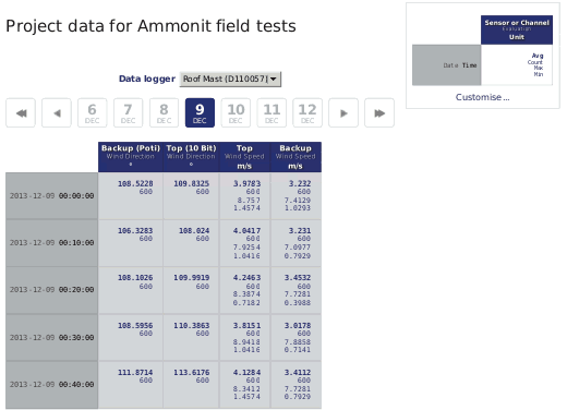
6.3. All measurement data
Measurement data can be inspected in the → menu. AmmonitOR displays for each day the recorded and calculated data for all active sensors and channels. Measurement data are also shown by clicking on a day in the Calendar (see Section 5.4, “Completeness Calendar”).
By default the last imported data is displayed. If the Measurement data are accessed via the Calendar, AmmonitOR displays statistics of the selected day.
The layout of the overview is described in the upper right corner of the page. The left column in dark grey colour lists date and time. The upper row in dark blue colour shows selected sensors, channels, evaluations, as well as the unit of the displayed value. The statistics are displayed line by line according to the layout in the upper right corner of the page.
Figure 6.71. Daily statistics
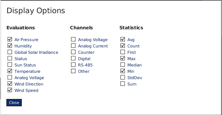
The layout of the
Measurement data can be changed in a box in the upper right corner of
the page. Click on
Customise to select
Evaluations,
Channels and
Statistics, which should be displayed in the table.
If the Measurement data are opened for the first time, the layout of the Measurement data has to be defined. If cookies are active in your browser, your configured Measurement data layout is saved for the next session.
Figure 6.72. Selectable options for daily statistics (depending on data logger type and connected sensors)
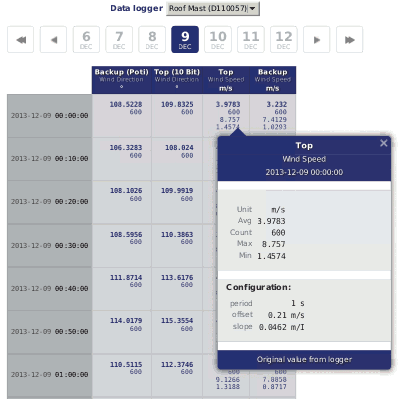
Click on the statistical value to displays further details, e.g., configurations like offset and slope.
Figure 6.73. Statistical details
Move to another day by clicking on another day in the timeline. Click on ► to go one day forward or on ◄ to go one day backwards. To go one week forward click on ►►; backwards on ◄◄.
If no data is available for the selected date, AmmonitOR shows available previous and next data. Click on the link to go to the day.
| Note |
|---|---|
AmmonitOR always displays the first three values of the next day. So you can better compare and monitor the statistics. |
If you want to view statistics of another data logger of the project, use the combobox above the timeline.